Working alongside UYO Collective, we helped transform SupaGarlic’s existing Shopify site into a more seamless, modern ecommerce experience, placing product at the forefront and simplifying the path to purchase.
We redesigned the homepage, elevated the product detail pages, and refined messaging, hierarchy, and layout across the site to create a clearer and more intuitive customer journey.
With paid media spend remaining consistent year-over-year (managed by UYO Collective), the updated site contributed to a 50% increase in revenue YoY, alongside uplift across all core performance metrics.
UI & Layout Refinements
We worked directly in Figma to explore both small and larger design updates before implementing changes into the live Shopify site. This included refining spacing, typography, colour use, and overall hierarchy to create a cleaner, more cohesive experience.
Product Page Improvements
The product pages were simplified and restructured to improve clarity. We adjusted layout, repositioned key information, improved benefit messaging, and refined the purchase section to make decision-making easier and more intuitive.
Custom Development & Enhancements
Alongside design updates, our in-house developer implemented more complex functionality including subscription dropdown improvements, bundle logic, and other structural adjustments. These changes strengthened usability while keeping the site fast and easy to manage.

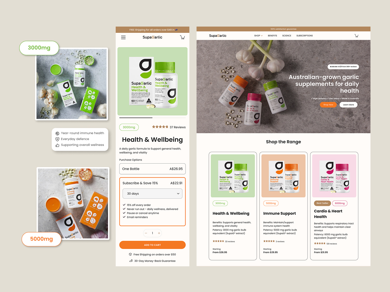
Homepage redesign: We shifted from a generic brand message to a product-led hero with clearer hierarchy, stronger contrast, and immediate proof points, making the value proposition easier to understand within seconds.
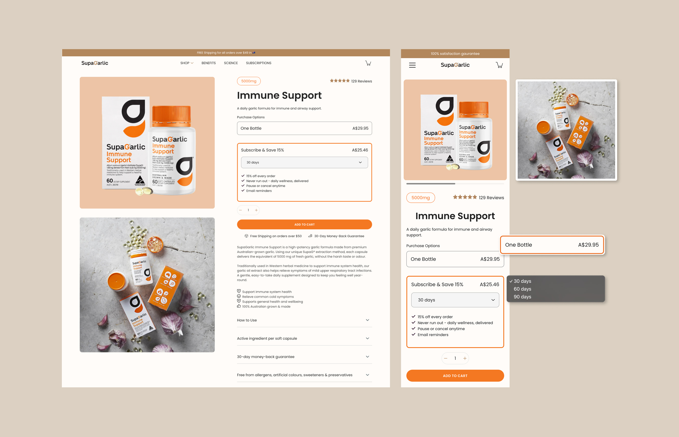
Clearer purchase decision-making: We restructured the PDP to clearly separate “Buy Once” and “Subscribe & Save” options, reducing friction and making the value of subscription immediately visible. The new layout prioritises pricing clarity, key benefits, and trust signals, helping customers confidently choose the option that suits them without confusion.
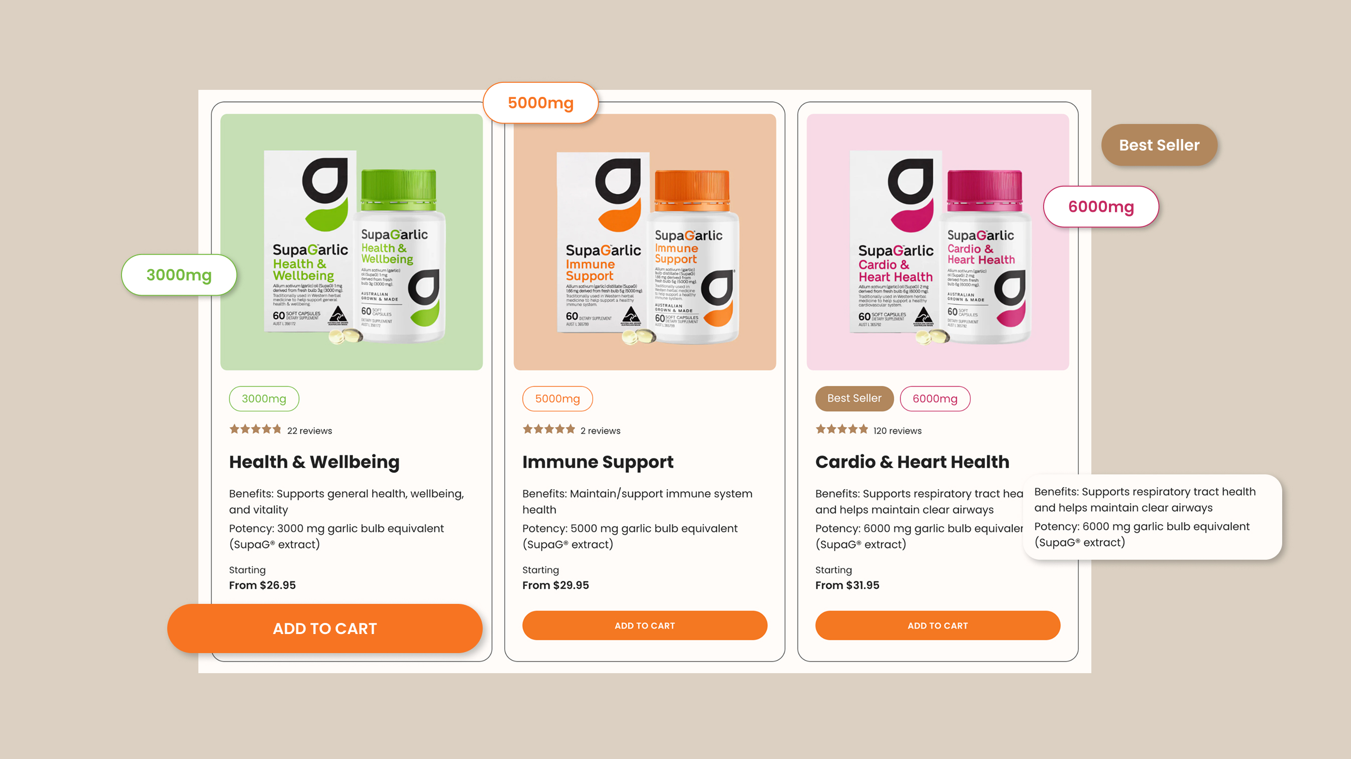
Improved product hierarchy: We redesigned the product cards to create clearer differentiation between variants, benefits, and potency, improving scanability and reducing cognitive load.
Highlights
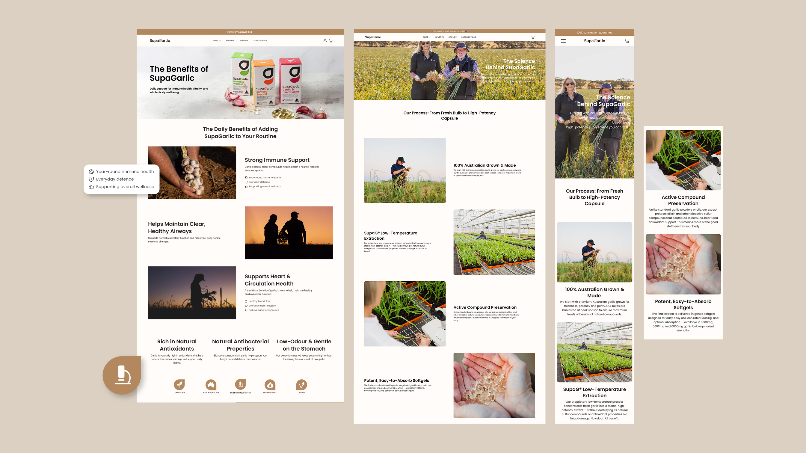
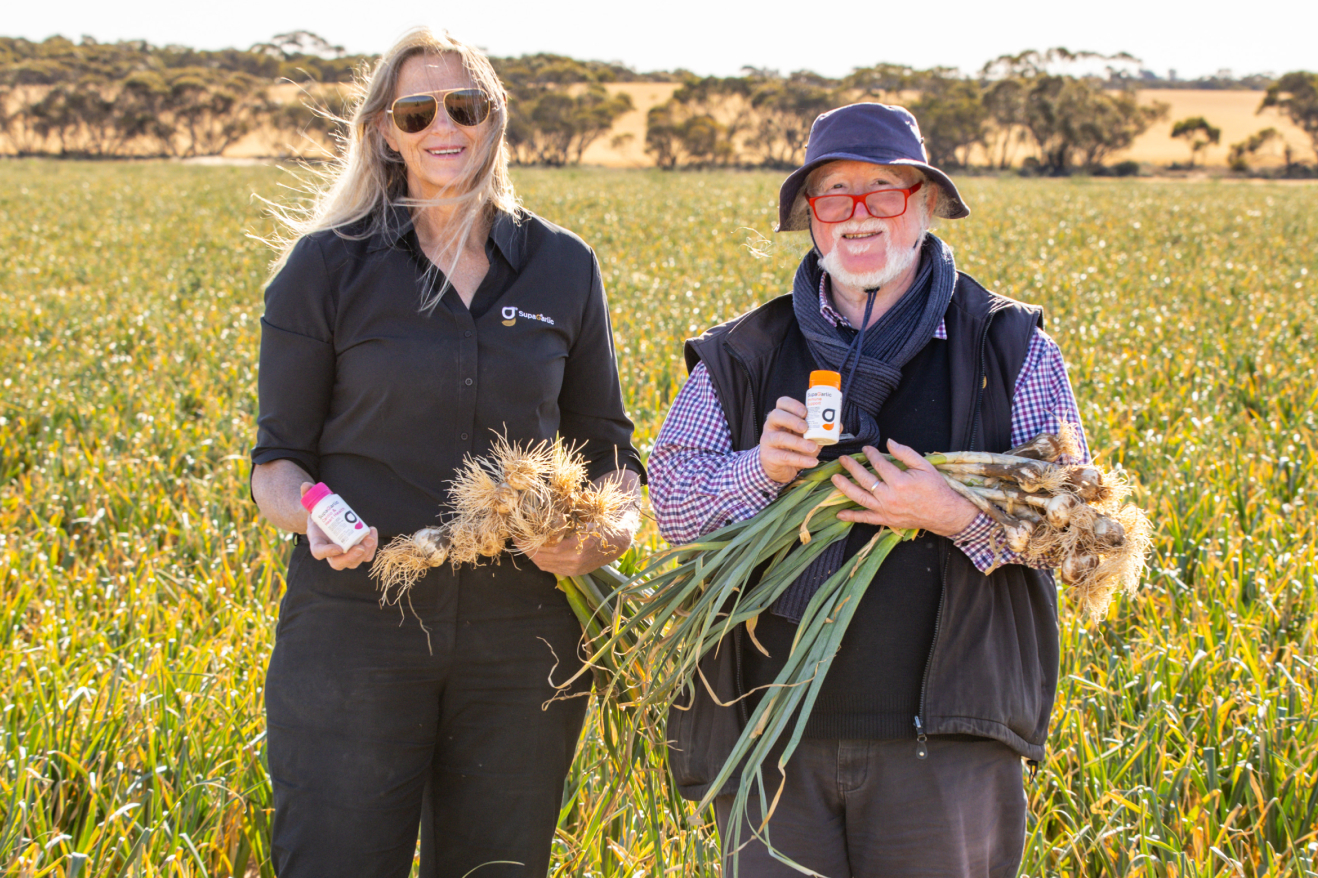
Elevated brand authority: We improved layout structure and content hierarchy across educational pages to better communicate SupaGarlic’s Australian-grown process and scientific credibility.