
Brand Strategy & Messaging
We transitioned Lee Christinson to Maine Wellness, positioning her as a unique, multi-modality practitioner. Rooted in Castlemaine, the brand reflects her evidence-based approach and connection to local community wellbeing.
Brand Visual ID
The identity incorporated nature, integrative health, and digestion themes. The final result was a grounded brand, organic logo with climbing vine and yin-yang balance, visually symbolising her interconnected philosophy of healing.
Website & Print
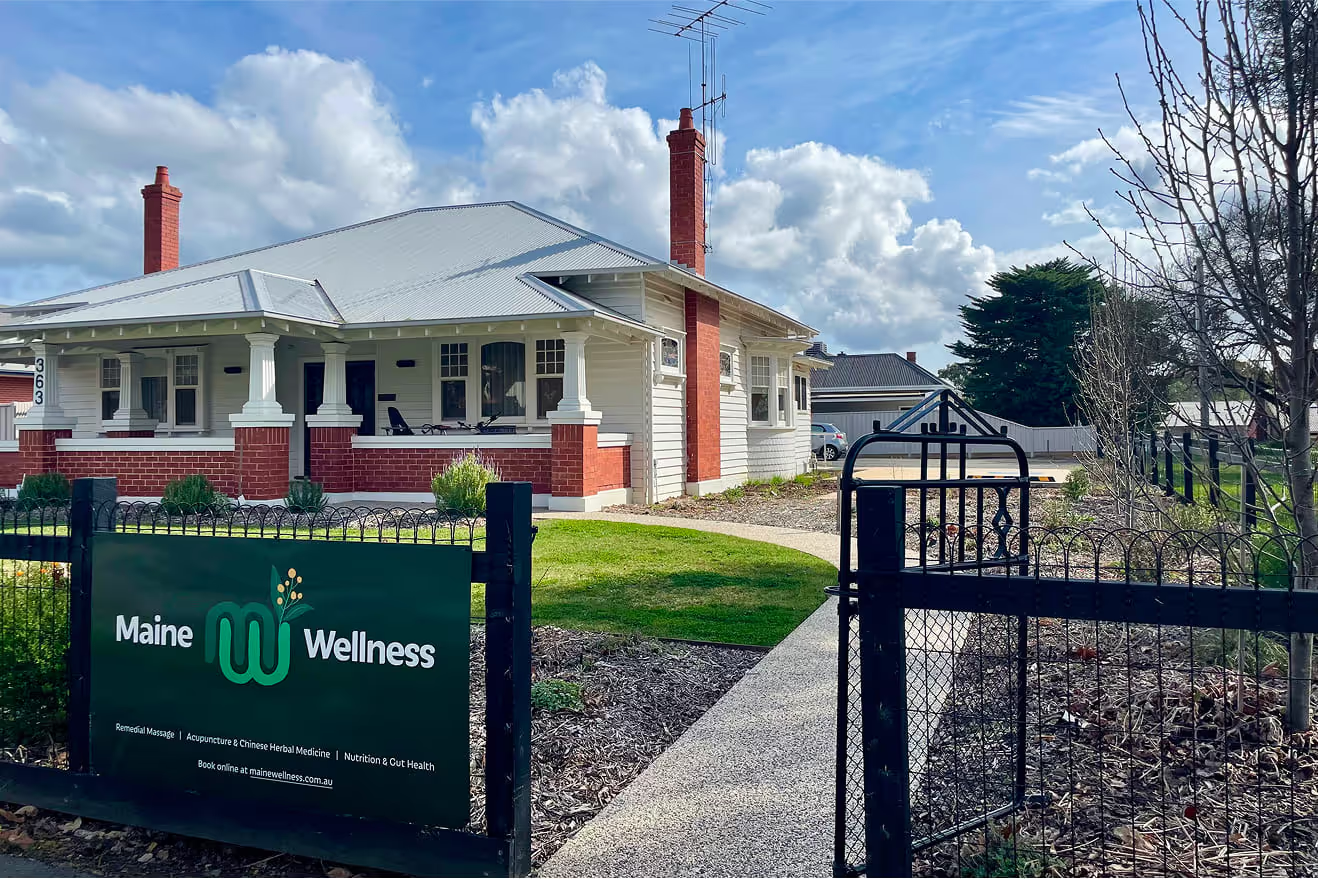
We created a Wix website with easy-to-use templates and integrated with clinic.co, complemented by practical print materials — signage, business cards, and flyers ensuring consistent, professional branding across all touchpoints.
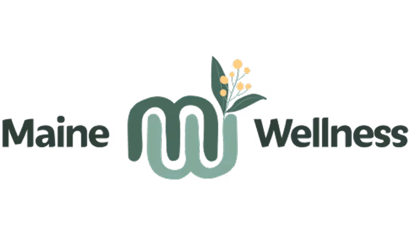
The new Maine Wellness logo visually plays with the idea of eastern and western medicine coming together, along with an abstract representation of an intestinal tract.
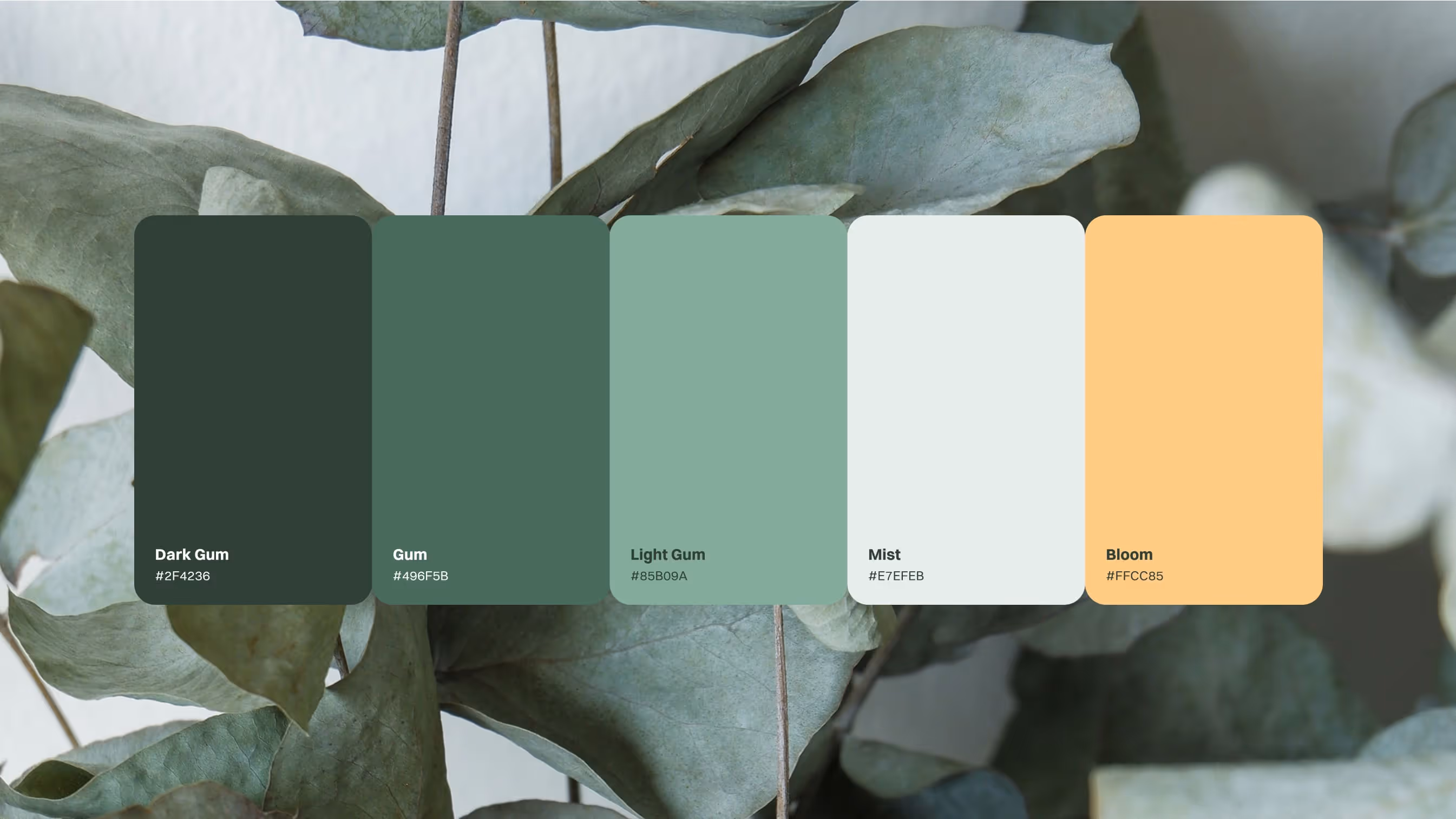
The new colour palette references the natural hues of the Australian bushland that surrounds the town of Castlemaine.
Highlights
Brand purpose: empowering healing for a better you
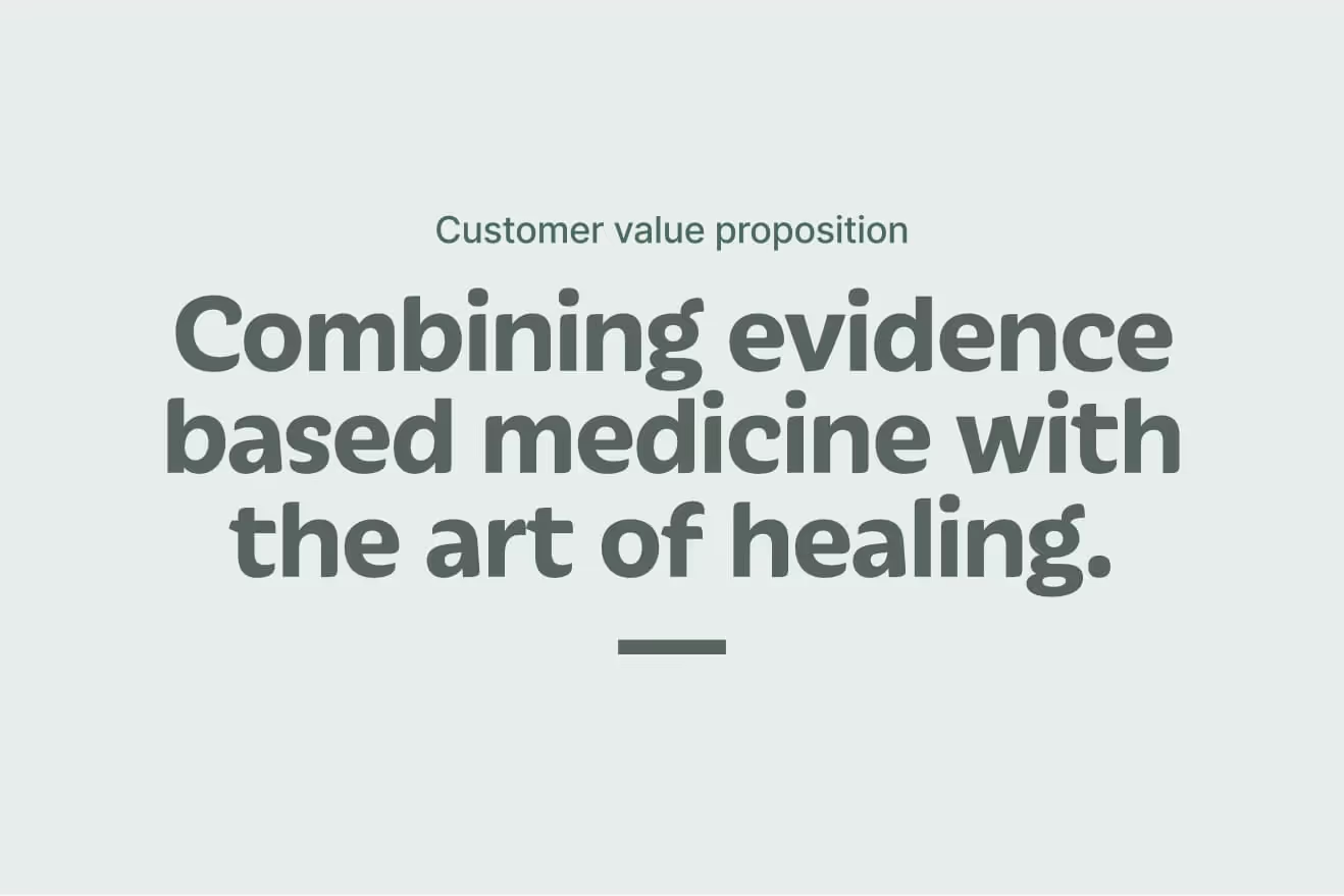
This project was intentionally designed as a lean and highly collaborative process. We partnered closely with Lee to co-create a brand strategy that reflected her philosophy and spoke directly to her intended audience. Together we clarified core values, articulated her purpose — empowering healing for a better you — and defined her value proposition of combining evidence-based medicine with the art of healing. The strategy culminated in a strong positioning statement and a new name, Maine Wellness, signalling her direction and connection to the Castlemaine community.
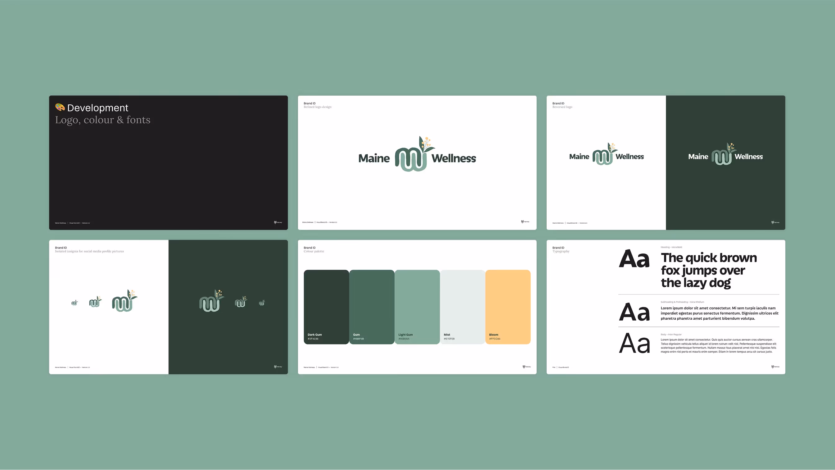
Visual brand developed included exploration of brand application, colour and typography.
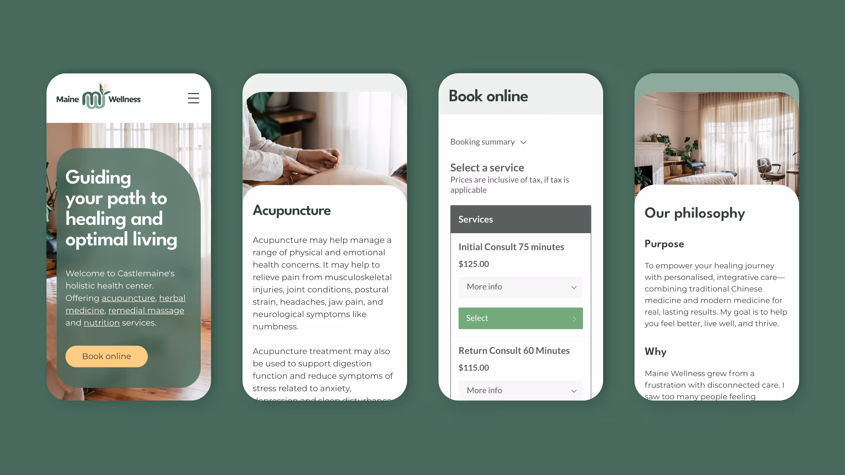
We co-built the Maine Wellness website in Wix. We set up the overall design theme, navigation structure, and templates, while Lee was able to take ownership of populating her own content. Once her copy and imagery were in place, we fine-tuned the layouts, adjusted styling for consistency, and handled the technical integrations to ensure everything worked seamlessly. This collaborative method reduced costs, gave Lee confidence in managing her own site, and ensured the brand felt authentically hers.
A visual brand identity that felt organic, natural and human
Lee wanted her brand to reflect interconnected health — rooted in nature and balanced between evidence-based Western and holistic Eastern traditions. Starting with green tones and a nod to the caduceus, we layered in vines, circular balance, and digestive references. The final mark intertwined the letters M and W with a vine and wattle motif, echoing yin-yang harmony and signalling her integrative approach. The result is a distinctive, grounded identity that captures her values both visually and emotionally.
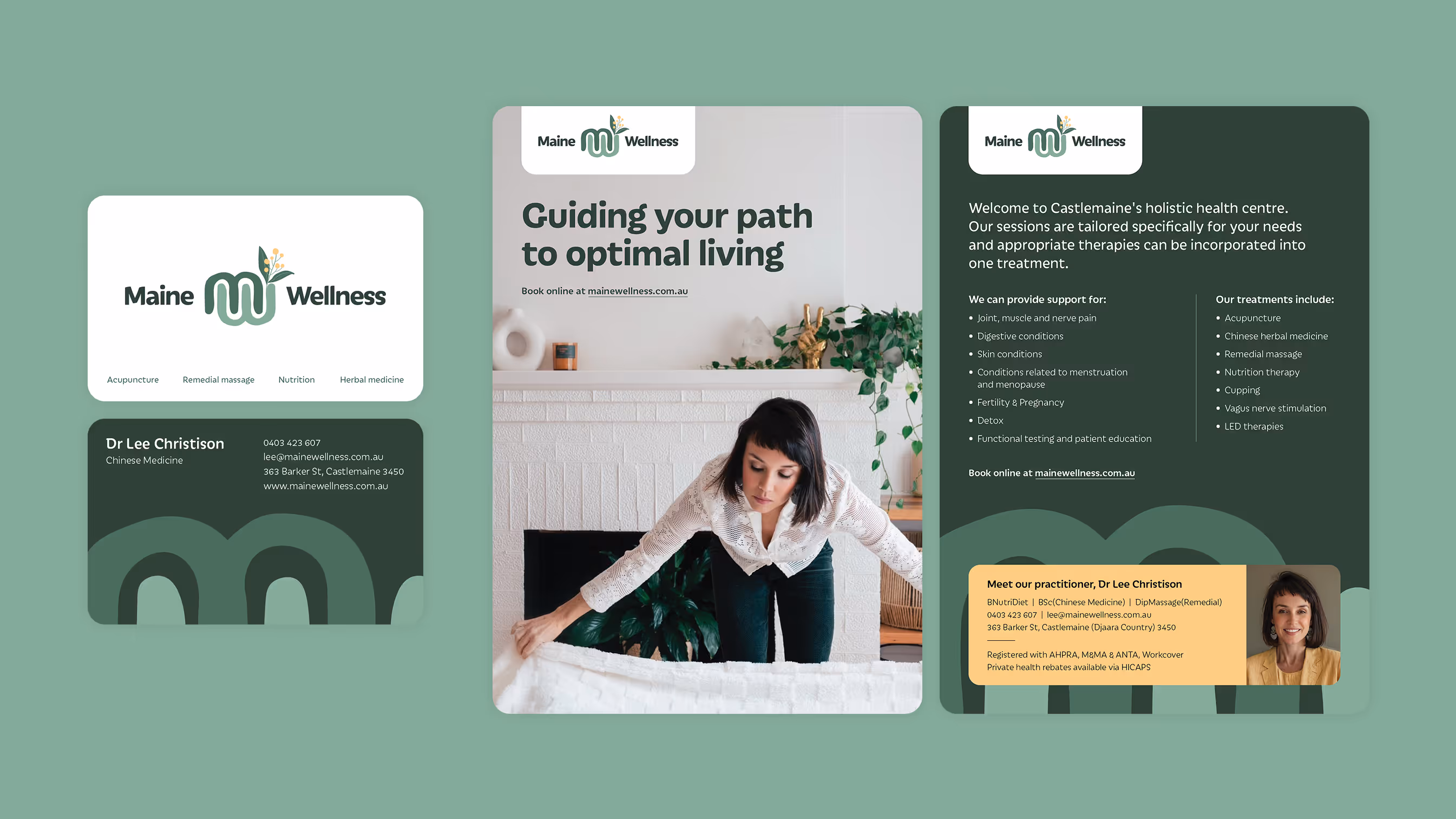
The fresh branding was rolled out across print outcomes like business cards, postcards, flyers, and clinic signage, creating a cohesive and professional identity at every touchpoint.
“I wanted to express my sincere satisfaction with the creative and excellent delivery of my new branding and website development. I am very happy and impressed with your professionalism, timely responses, creativity, and technical skills. Thank you again for all your hard work."
– Lee Christison