Honouring Tierra’s warmth and roots while crafting their next chapter
Tierra Bulk Foods has earned a devoted following through its vibrant farmers-market presence, known for its warmth, its Spanish heritage, and its commitment to the freshest, most flavourful Mediterranean pantry staples. As Tierra prepared to grow beyond the markets into retail and e-commerce, we partnered with the founders to shape the brand’s next chapter.
Grounded in Tierra’s purpose “inspiring a world that slows down to savour food,” we refined the brand strategy, refreshed the visual identity, and created a packaging and labelling system that could flex seamlessly across markets, retail shelves and online.
Brand Strategy
We helped clarify Tierra’s brand positioning and messaging by articulating their purpose, values, audiences and value proposition — centred on handpicked Mediterranean seasonal pantry staples from growers and makers they know and trust.
Visual Identity & Store Design
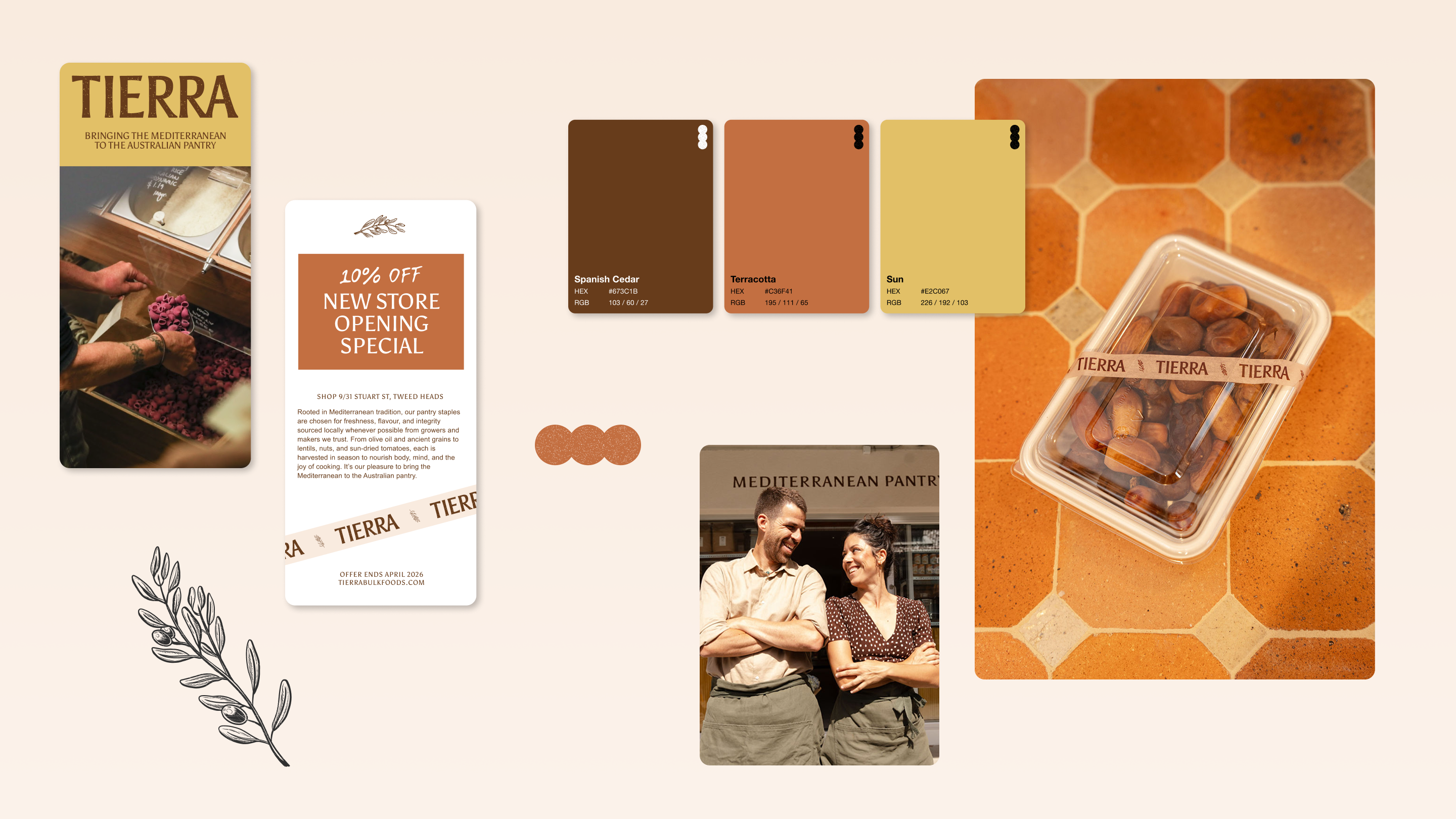
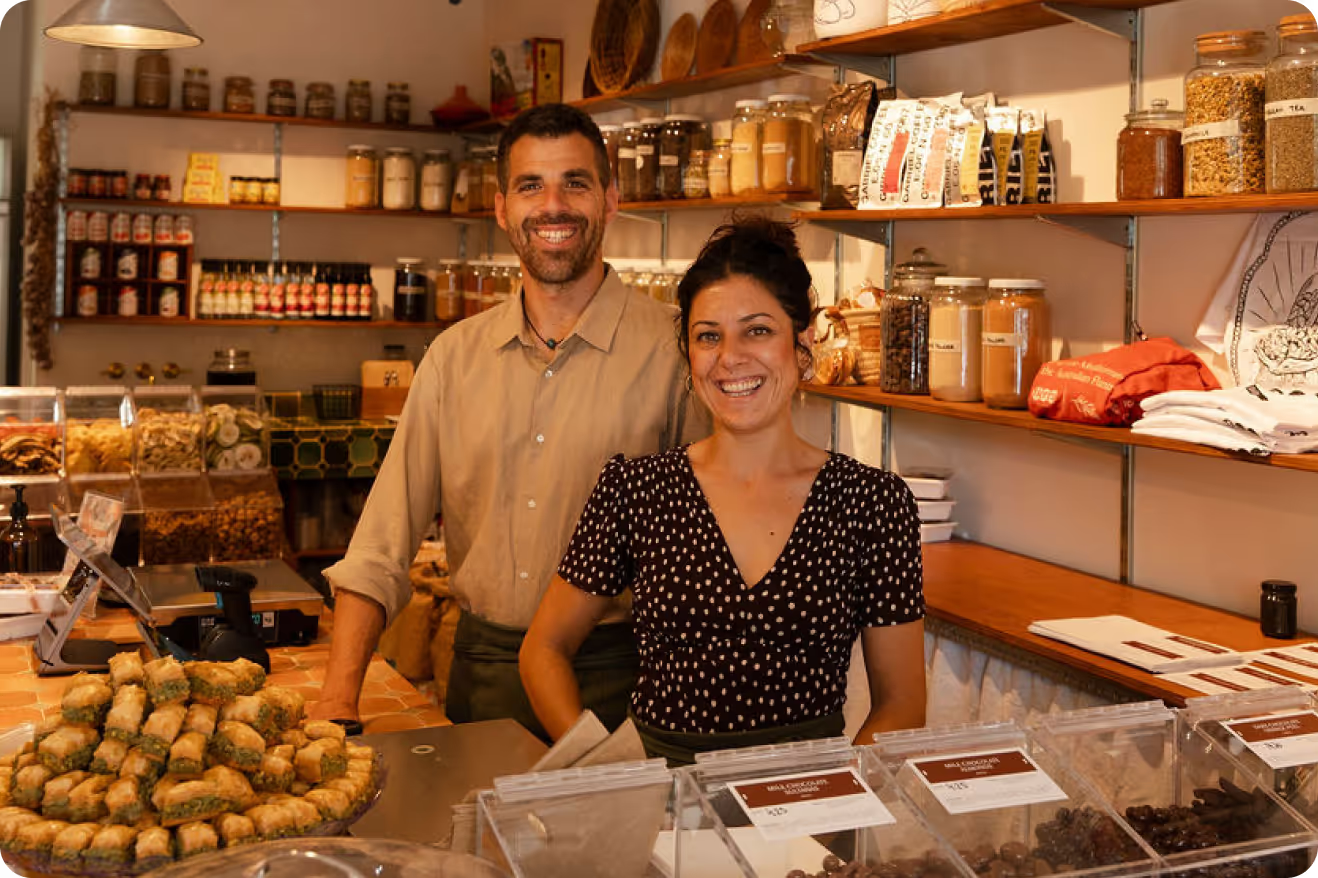
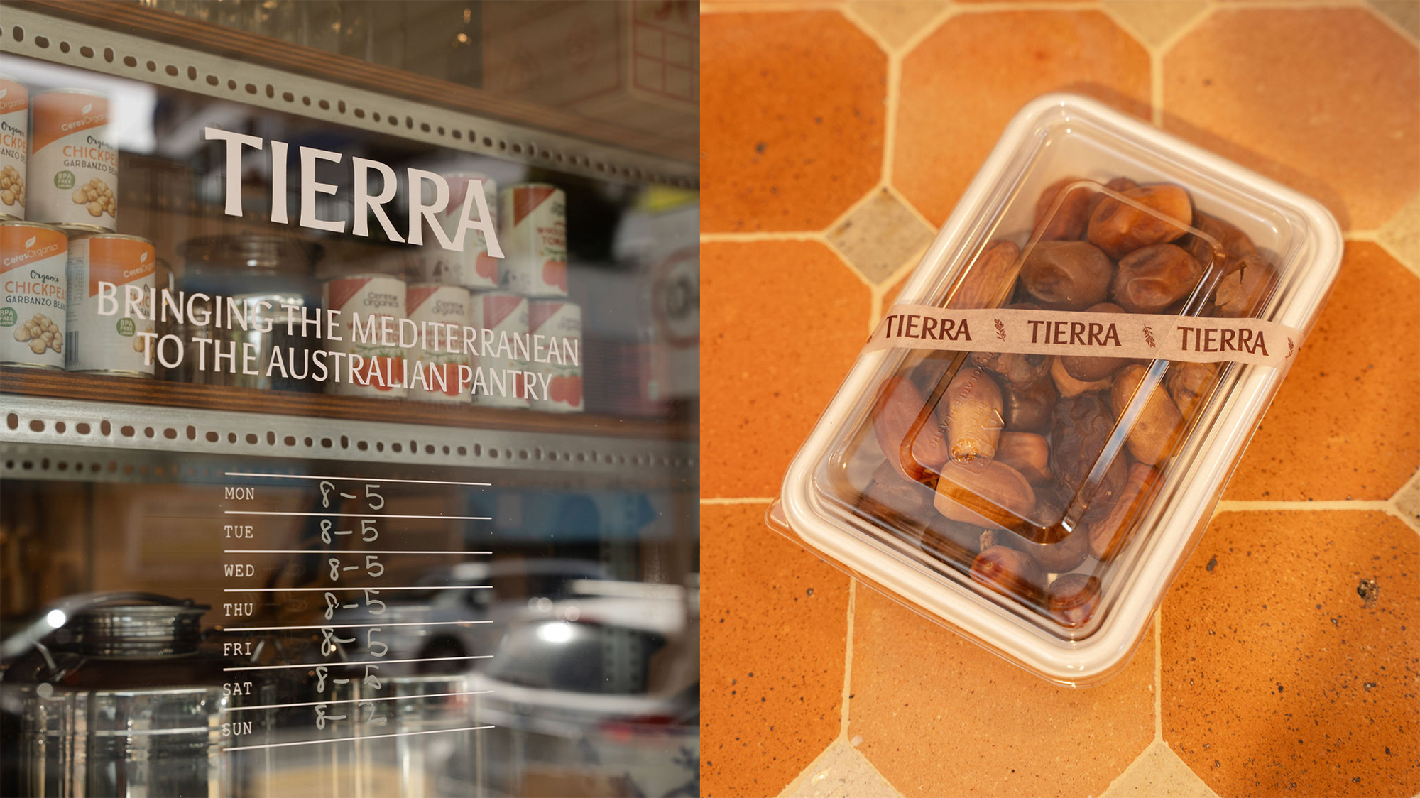
We refined Tierra’s logo, typography and colour palette to create a warmer, more expressive identity aligned with the sensory experience of shopping with Tierra. The refreshed identity also informed a renewed storefront direction, balancing Mediterranean cues with a clean, contemporary feel.
Packaging & Label System
With over 300 rotating products, Tierra needed a labelling system that was both consistent and efficient. We designed a flexible suite of labels and built a spreadsheet-to-design workflow that automated product data, pricing and codes, later templated in Affinity for easy use. The result is a cohesive set of labels across jars, pouches, tubs and in-store bins, all reinforcing Tierra’s focus on freshness and provenance.
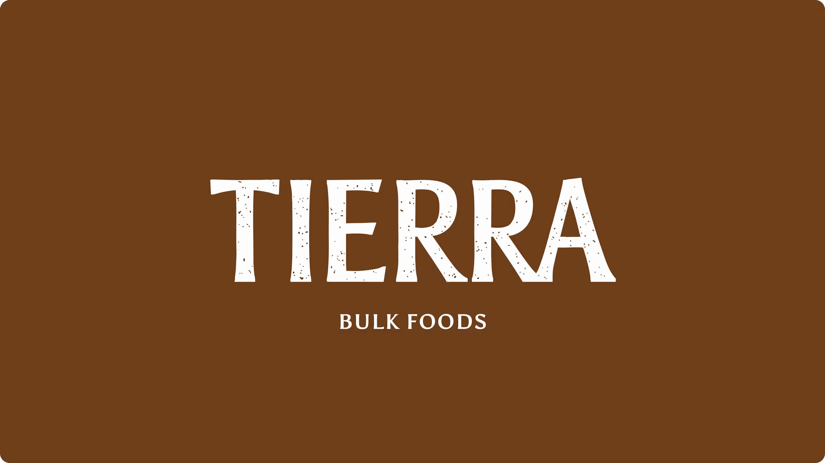
Logo evolution: A cleaner, more confident wordmark inspired by Mediterranean typography, designed to hero the Tierra name across storefronts, packaging and digital touchpoints.
Highlights
Graphic Elements
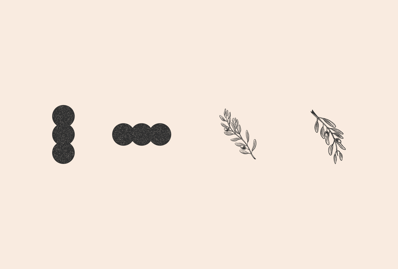
The signature three-dot motif (carried over from the original logo) nods to the rounded shapes of grains and old store barrels, becoming a subtle anchor across applications. Paired with hand-drawn herbs and olives, the system adds texture and Mediterranean character without overwhelming the simplicity of the identity.
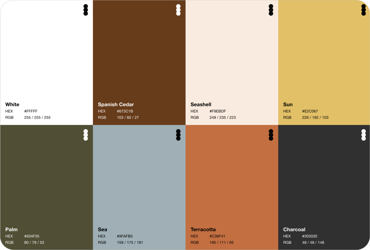
Colour Palette
A rich palette of Spanish Cedar, Terracotta, Sun and Seashell, grounded by earthy Palm and Charcoal. Inspired by Mediterranean landscapes and the natural tones of Tierra’s ingredients.
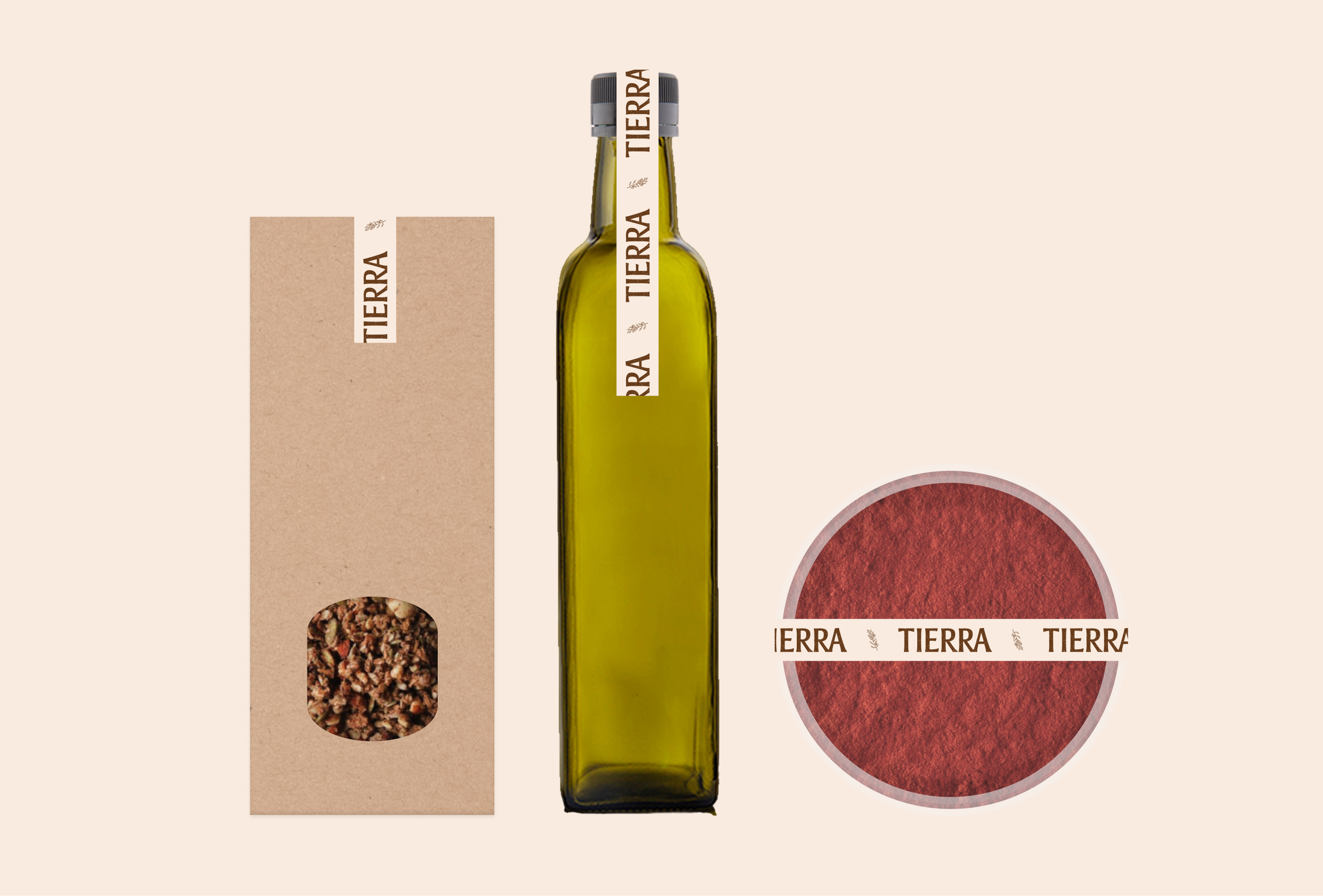
Packaging System
We created a minimal packaging system that brings warmth and craft to Tierra’s products. Branded washi tape and simple Mediterranean illustrations add subtle character, giving jars and packaged goods a cohesive, handcrafted feel.
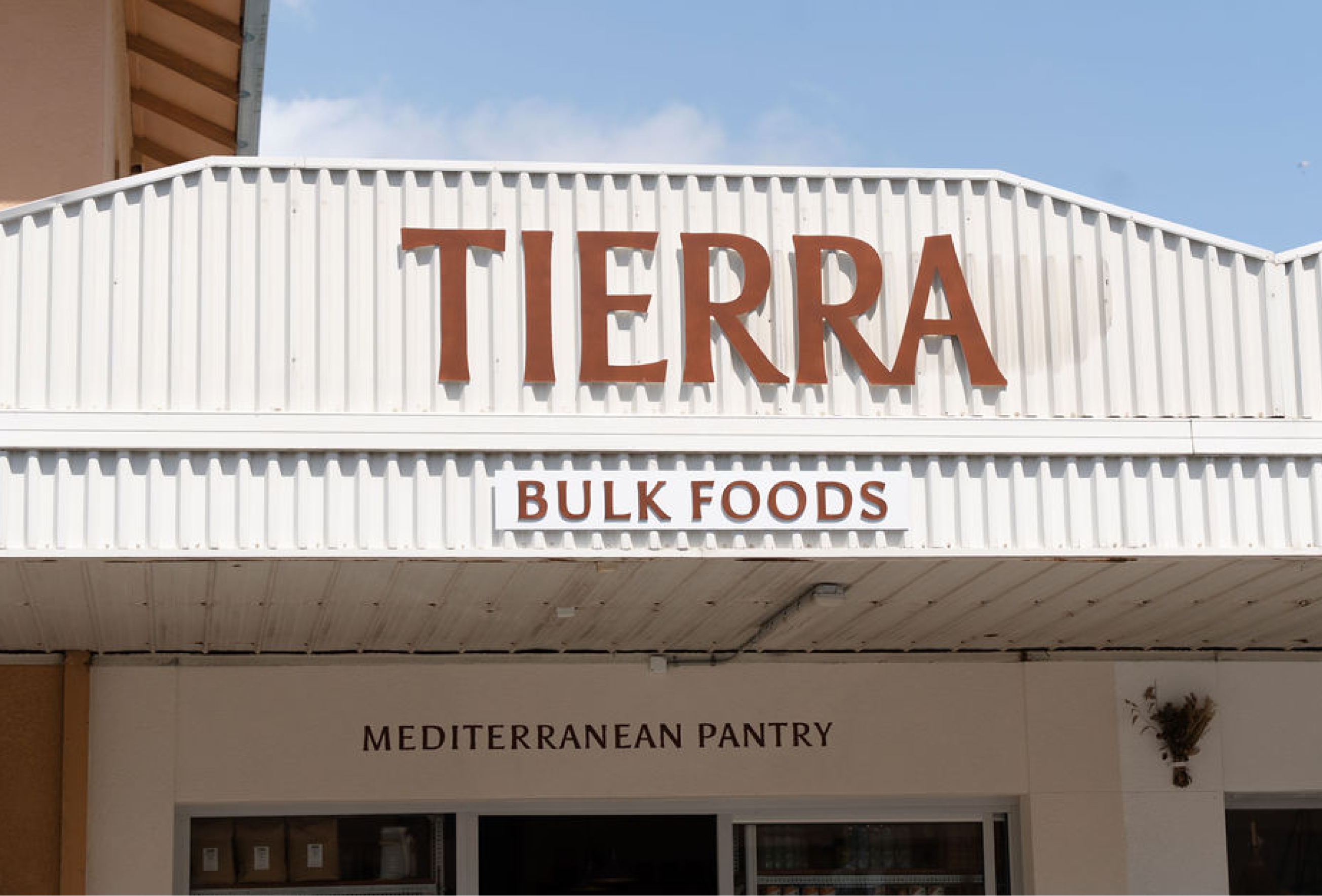
Store brand & signage
A refreshed façade and signage system that brings clarity, warmth and character to the retail experience while staying true to Tierra’s roots in market culture.
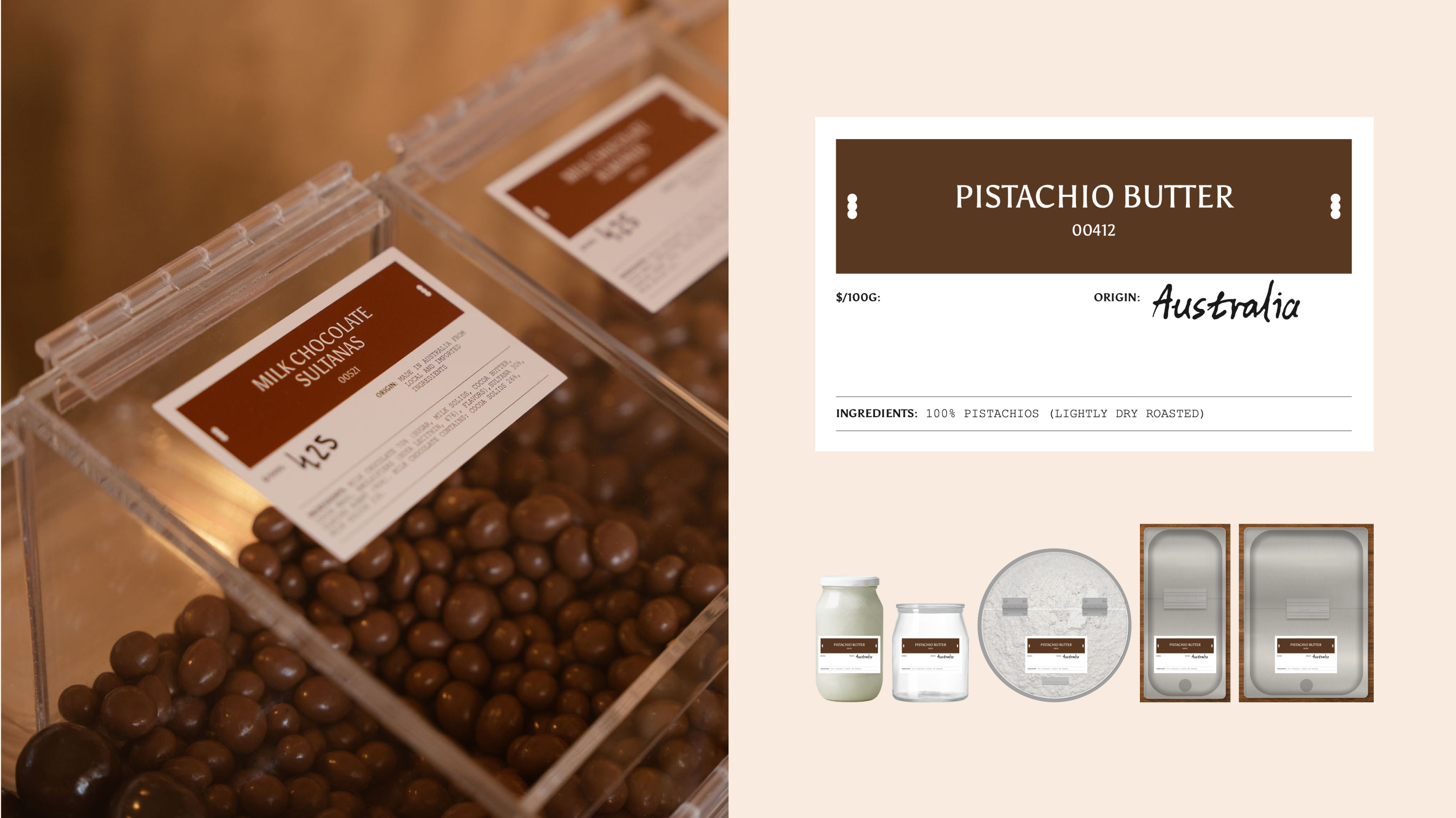
In-Store Labels: To manage hundreds of rotating products, we created an efficient label system driven by a structured spreadsheet that feeds directly into templated designs. This keeps all pricing, codes and product details accurate and consistent, while maintaining a polished, on-brand look throughout the store.
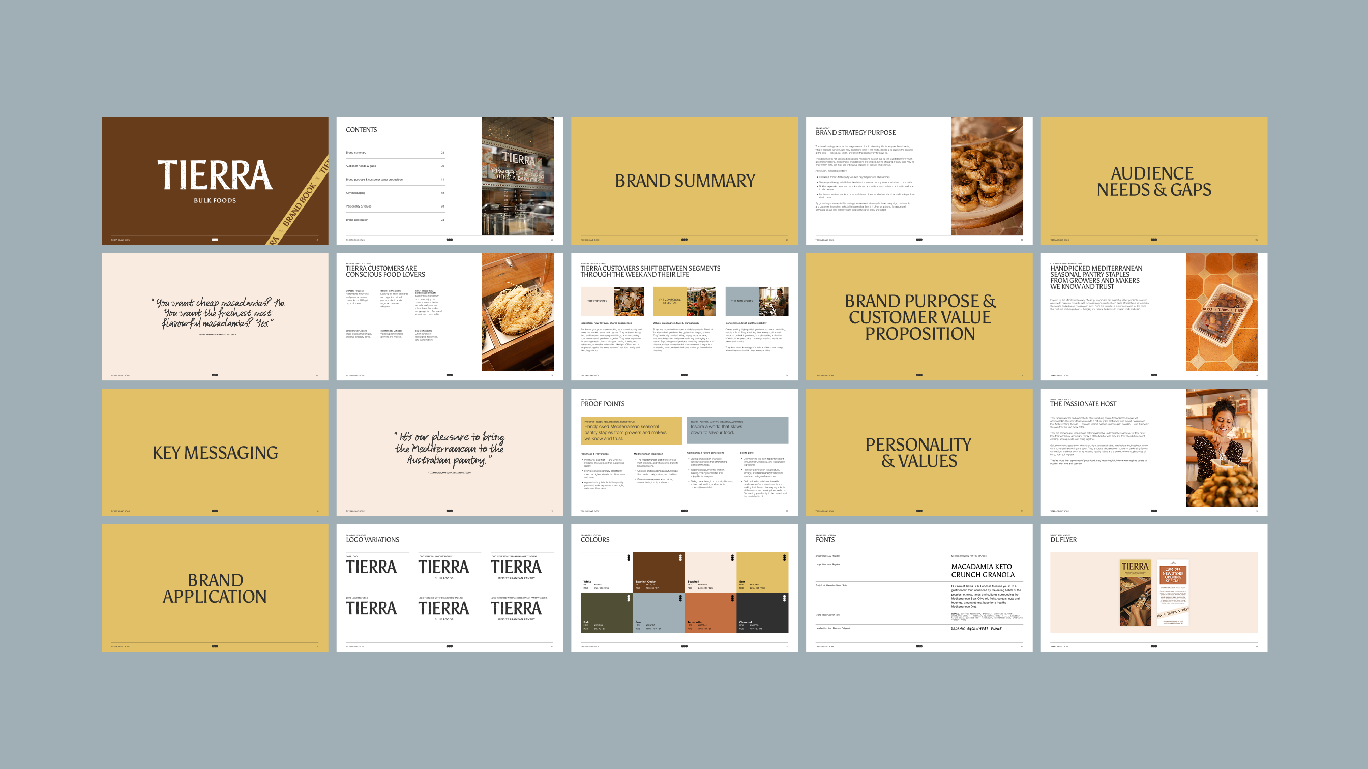
Brand Book: We created a comprehensive brand book to capture Tierra’s refined strategy and identity in a clear, practical resource. It brings together the brand purpose, personality, values, messaging and visual system into a cohesive guide the team can use across markets, retail and e-commerce.
Tierra opened the doors to their new retail store in Tweed Heads in November 2025, rolling out the refreshed brand, labels and store signage with a lot of thoughtful touches. The space reflects the same care that goes into their products — created with time, intention and a whole lot of heart (shout out to Make Good Studio for the collaboration on store design)
A word from the client
"I truly fell in love with my own brand again through this deep process. Taking the time to explore all the different aspects of the brand, elements that often get lost in the day-to-day operational flow, was incredibly meaningful. Revisiting the structural foundations of both the company and the brand reminded me why it exists in the first place. It was a beautiful and grounding experience to reconnect with those core ideas and values." - Elena Pastor, Tierra Co-Founder