


The brief
bobby is a healthy soft drink brand with a strong, youth-focused social following. But a dated, neglected website was holding back sales, so bobby brought in Pacer and Harvey for a fresh site and ad strategy.
Our approach
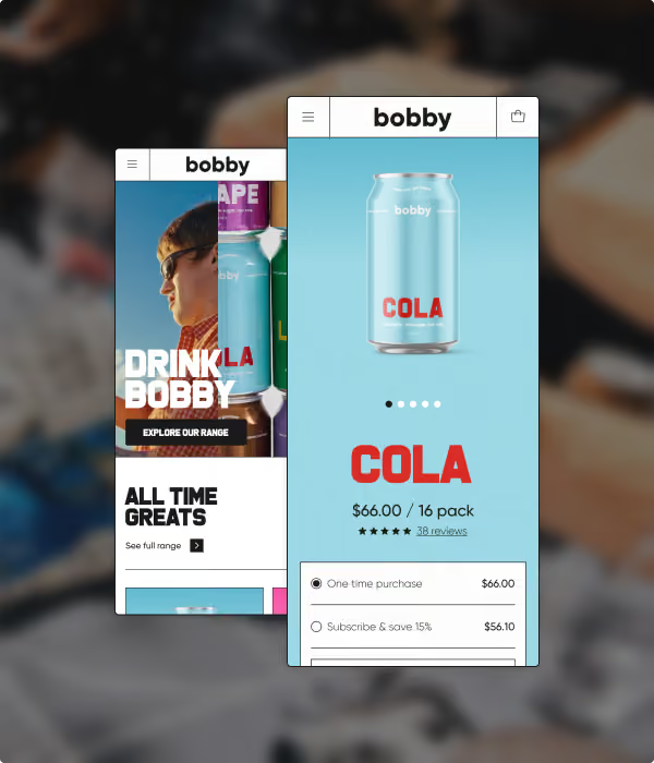
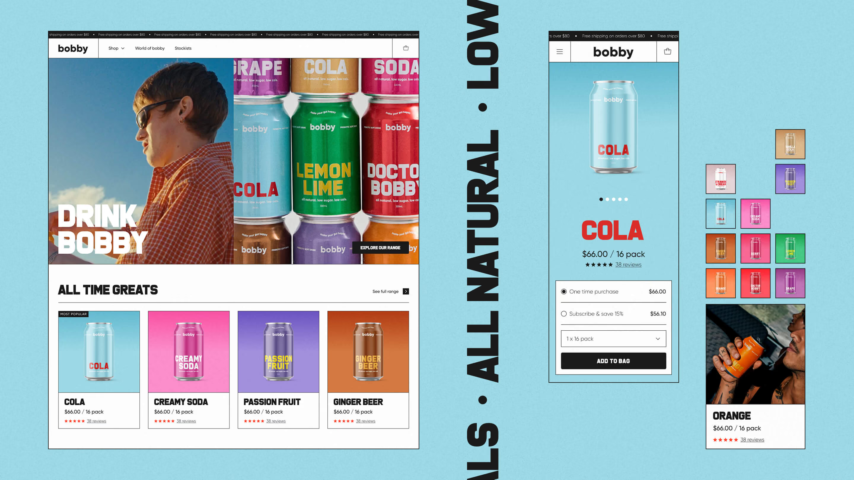
With a strong brand identity and a large asset library to draw on, we set out to bring that bold personality to an e-commerce store — leaning into bobby's typography, bright can colours, and photography for bespoke, colour-coded product pages.
Impact
The site got a real visual and technical uplift to match Bobby's busy marketing schedule. New features like pre-order and notify-me plug-ins give the brand room to scale as it grows.
A bold look for a bold brand: Typography, colour and photography are all incredibly strong features of the bobby brand, so it was important to ensure these were key aspects of the design uplift.
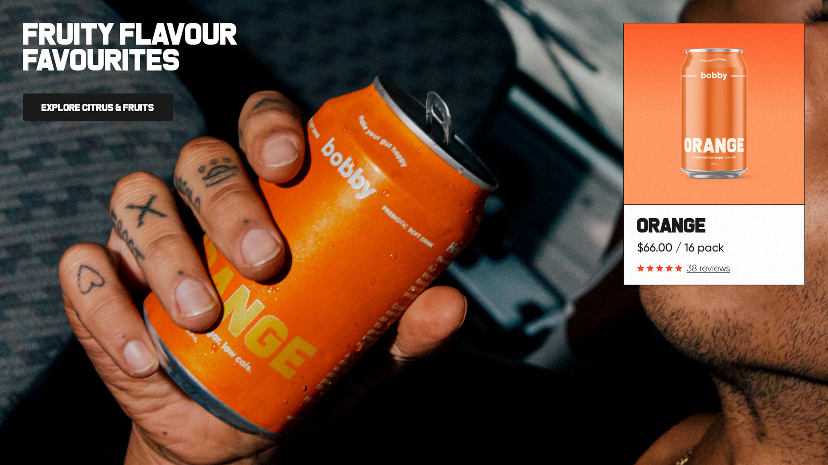
Smart content approaches: We developed a flexible set of components to allow bobby to cross sell different products based on flavour profiles, keeping the user engaged as they explore the site.
Colour coded: Each product page is uniquely coloured with the two product hero colours, which makes for a vibrant and bespoke user experience.
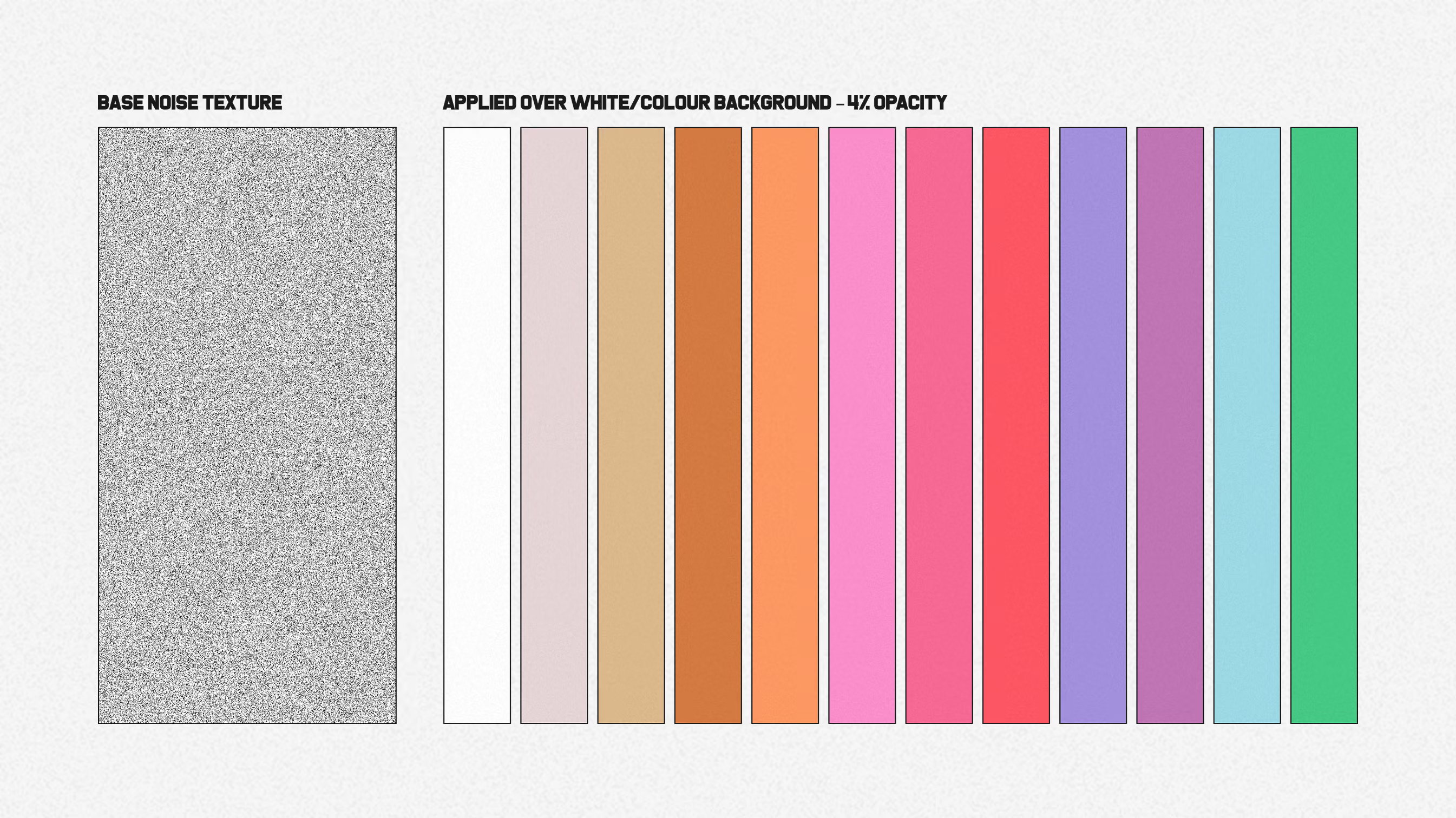
Add some texture: The bobby brand, and much of it’s marketing photography has a bit of a retro vibe, so we introduced a subtle noise texture to the site to match that vintage feel. We updated the theme to allow fine control of the texture strength, allowing bobby to dial it up or down depending on the colour being used.
Highlights
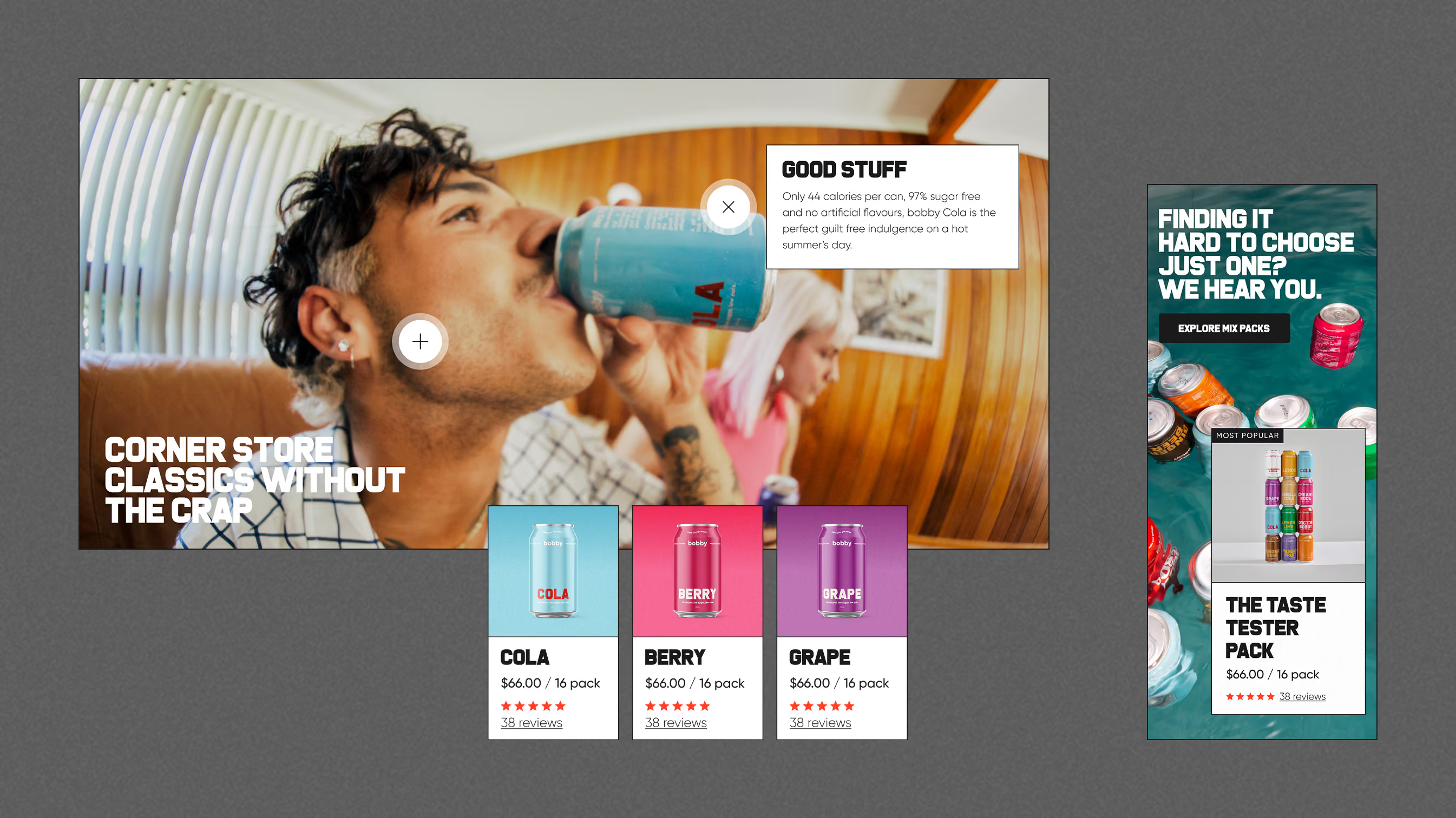
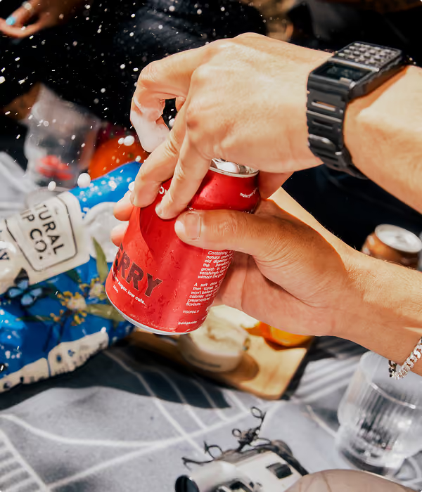
Photography and colour: The bobby brand has a huge library of amazing photography, and each product has it’s own set of feature colours. We worked hard to ensure that these elements were a core part of the site, creating an engaging and fun user experience throughout every page.
Harvey and the team were so great to work with - collaborative, design-minded and always available. They exceeded our expectations, balancing our visual direction with conversion and performance. We’re really happy with the result, would highly recommend!
Olivia Murdoch